Museum-grade quality prints Worldwide shipping Largest video game art selection in the world Lifetime guarantee on prints
From Classic Sonic to Movie Sonic

article

From Classic Sonic to Movie Sonic

Is Sonic as iconic in a movie as in games?

Arjan Terpstra

07 Feb 2020 ⋅ 5 min read

Sonic the Hedgehog’s movie redesigns drew a lot of attention, to put it mildly. Controversy has always been part of Sonic’s design, dating back to the first major changes to the beloved character. A design saga in five stages.

Stage one: Classic Sonic

Around 1990/1991, a hedgehog was born from the felt tip of (SEGA’s game artist) Naoto Oshima’s pen. Called ‘Mr. Needlemouse’ in early drafts, the animal was defined by round features, sky blue skin tones and soft, protruding spikes; a pinkish pot-belly complemented the pointy red sneakers. The design followed the rulebook of Japanese manga characters: anthropomorphic animals (ie. showing human characteristics) with a head that’s disproportionately big and has large eyes. Also, as a nod to Disney, Sonic was given a pair of white gloves and socks not unlike those of Mickey Mouse.

Further details were absent: there wasn’t much detail to be had in a pixel sprite character when the first Sonic the Hedgehog game launched in 1991. In our Sonic the Hedgehog Art and design book programmer Yuji Naka explained the importance of ‘readability’ in the game. “I was very careful about having the character be recognized even in silhouette.” Imagery featured in marketing and in the first televised Sonic animation series, for other practical reasons, stayed close to the monochromatic look of cartoon characters. ‘Mr. Needlemouse’ later came to be known as ‘Classic Sonic’ - the Sonic the Hedgehog of all 2d games that catapulted him to worldwide fame.
Sonic (SEGA)
© SEGA

Some of Naoto Oshima's original drawings for his 'Mr. Needlemouse'. Image taken from the Sonic the Hedgehog 25th Anniversary Art Book.

Stage two: Modern Sonic

Sonic underwent his first major redesign around 1997, when SEGA steered the blue blur away from 2D pixel art and into the polygon world of 3D gaming. A new lead designer, Yuji Uekawa, had to deal with a new perspective on SEGA’s mascot - literally! No longer did players see the character in 2D and from the side, but in 3D and from the back, which raised various questions about his appearance: where, exactly, were those back spikes protruding from now that they were three dimensional? And what did the underside of his shoes look like?

Moreover, the third person perspective of the player camera (pointed at Sonic from above and behind) meant Classic Sonic suddenly looked much shorter and rounder than before - more like an obese mouse than like the fastest hedgehog on earth. Hence Uekawa’s restyling of Sonic to ‘modern Sonic’, giving him a much sleeker body, greater height, a darker hue and a dynamic posing in a (very 1990’s) ‘graffiti style’. Not to everyone’s liking though: the sleek, ‘modern’ version launched with Sonic Adventure (1998/99) met with resistance, especially because of his green eyes - they had been all-black in the early years, so why change this to a ‘Green Hills’-inspired hue of green?

Stage three: Sonic Boom

In 2014, Sonic became even taller than before. A games and television series adaptation by Sonic Team and American studio Big Red Button reimagined him once again. The idea was to adapt Sonic for younger (television) audiences who probably never heard of Classic Sonic, or of Sonic the Hedgehog at all, as the blue blur’s popularity was on the wane by this time. For ‘Sonic Boom’ - the name of the new TV-series and games - artists looked at Sonic’s attributes and personality, and stressed his adventurousness and agility once more. Arm and leg wraps taken from American athletes stressed his ‘can-do’ mentality, and a brown scarf (an ‘action adventure trope’, according to the artists involved) suggested his love of adventure. To further distinguish Sonic from the other characters in the cast (an elegant Amy, a square Knuckles, and shorty Tails) his height was increased, too.
Oh, and those green eyes? They stayed.
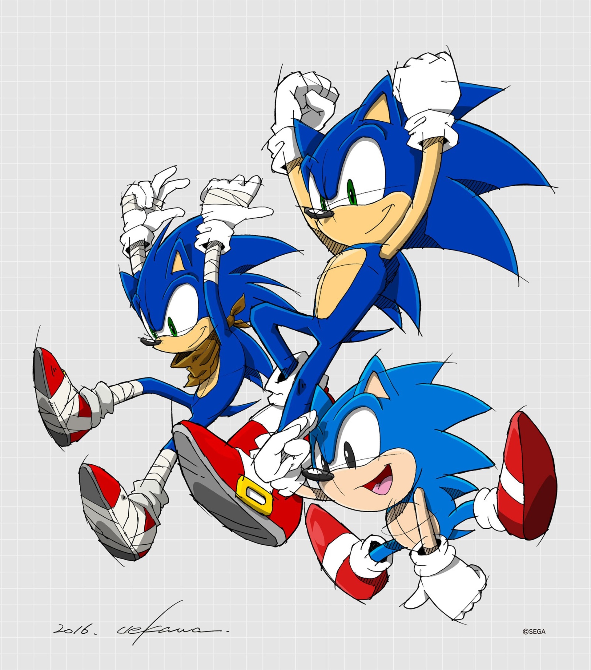
Sonic by Uekawa (SEGA)

Lead designer Yuji Uekawa drew this unique image for Sonic's 25th anniversary. Uniquely available as art print in the Collector's Edition of our Sonic book, this image combines Classic and Modern Sonic, plus the Sonic design from Sonic Boom.

Stage four: Movie Sonic

Easily the most controversial redesign brings Sonic back to, well, basically a hedgehog. Sonic fans were not amused when the first trailer for a new Sonic the Hedgehog movie aired April 2019. As was obvious from the trailer, Sonic was meant to be more ‘realistic’-looking, leading to body proportions that steered away from the ‘manga’ origins of Classic Sonic: his head now was sized like a human’s head, atop a human torso, supported by human-sized (and much thicker) legs. Losing the oversized eyes, his face now looked small-ish, scrawny - much like an underfed mouse, rather than a funny and cool hedgehog. In contrast, his quills didn’t resemble quills anymore, but stood out like a peacock’s tail. Detail-wise, the design showed a lot of fur - unkempt fur, from the look of it, with furry paws that somehow went without the iconic white gloves.

The design wouldn’t last. After a heavy online backlash the movie release date was delayed, and a new design was implemented that dropped the realism altogether and played to the strengths of the Classic and Modern designs.
Sonic the Hedgehog (Paramount)
© SEGA/Paramount

The first Sonic designs for the Sonic the Hedgehog movie scared many fans. The backlash online forced film studio Paramount to change the design in the final movie (Image: Paramount).

Stage five: Movie Sonic redesigned

Trailer number two (released November 2019) went down much better. A new Sonic design harked back to both Classic and Modern Sonic designs, donning the lighter blue of Classic Sonic but also the green eyes of Modern Sonic. Bodily proportions and head size were back to the cartoon/manga style, with large eyes capable of communication expressions that had seemed beyond the mous-ey face of trailer-one Sonic.

Finally, people felt, the tone and personality of Sonic the Hedgehog were properly displayed in this live-action-meets-CGI movie, successfully transitioning a well-known and loved game and cartoon character to film, preserving the essence of what Naoto Oshima drew in that iconic ‘Mr. Needlemouse’ sketch.
Sonic, refurbished (Paramount)
© Paramount

The final design for Sonic in the movie Sonic the Hedgehog clearly references both Classic Sonic (round shapes) and Modern Sonic (green pupils).

Sonic The Hedgehog Art & Merchandise

Gotta go fast

Watch Now
The official SEGA art book

Sonic the Hedgehog 25th Anniversary Art Book


The official SEGA art book