Museum-grade quality prints Worldwide shipping Largest video game art selection in the world Lifetime guarantee on prints
Designing Overwatch

article

Designing Overwatch

Dissecting the iconic Blizzard hero shooter games Overwatch and Overwatch 2.

Arjan Terpstra

24 Oct 2022 â‹… 7 min read

Designing a new game, or even coming up with a game idea, can be a hazard for any artist or developer. But for those working at Blizzard, back in 2013/2014, the prospect of building something that would be on par with the games the company released before, must have been daunting indeed. World of Warcraft, Diablo and StarCraft all were massively successful games around that time, establishing Blizzard as one of the top creative studios in the games industry, so how do you top that?

The answer, as is evident from the many designer interviews around Overwatch and Overwatch 2, is: by sticking closely to the Blizzard rulebook, and yet throwing it out the window once you establish a baseline concept. Sounds strange? Check out any Blizzcon interview or read any of the Art of Overwatch art books, and you'll find exactly that: Blizzard games all hatch from the same nest, are imbued with the same Blizzard DNA, except each game develops into something wildly different once the team are sure about what they want to make.

Visual legacy


"From the beginning," the Overwatch team writes in the book The Art of Overwatch 2, "we aimed to create something new and familiar. We wanted to imbue Overwatch with an aesthetic all its own, but we also wanted to embrace the visual legacy that Blizzard had already established." In practice, that would mean any new Blizzard game would feel familiar, a part of the larger Blizzard family of games, and yet would feel new as well.
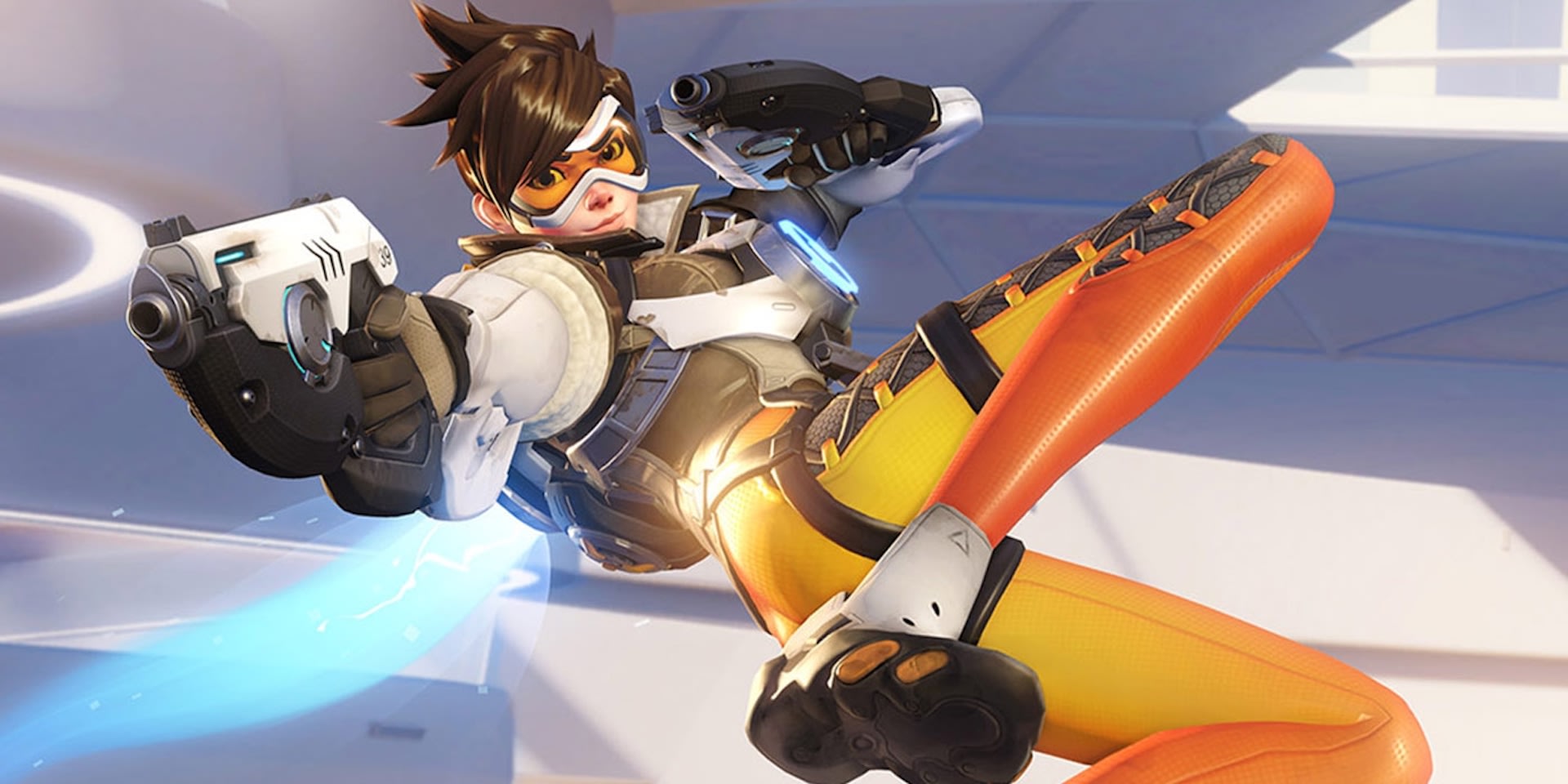
Overwatch01
© Blizzard Entertainment
For those who find it hard to square "an aesthetic all its own" with "embracing the Blizzard visual legacy," let's track back a little bit. The team that would be known as the Overwatch team started as a small team coming off another title, called Project Titan. The game played out on a future planet Earth, and was supposed to be the next MMORPG for Blizzard, with a class-based shooter mechanic at its core. Rumor has it the gameplay became too cluttered and confused after too many skills and combos were employed, and Blizzard decided to kill the project before much was shared with the public.

Hero-based shooter


This left the team not only with the profound sadness of abandoning a project they loved, but also with a ton of great "near-future" shooter concept art that suddenly was without a game. Spirits lifted when game director Jeff Kaplan pitched a new idea of building a hero-based shooter. This not only looked good from a gameplay perspective (not the least because it would add a fresh genre to the Blizzard games roster), it also resuscitated the Project Titan art, that could now be used as a basis for the style and themes of the new game.

The Kaplan pitch outlined a couple of things the art team could work with. The new game should focus on the heroes, their individuality and backstories, energizing the work of character artists. Next to that, artists had a blast developing a near-future Earth for the game, with locales that doubled as fighting arenas. For both, the groundwork had already been done in Project Titan, but soon the new game idea found its own rhythm, and a visual ruleset that would inform the game going forward.

Art pillars


Overwatch artists William Petras and Arnold Tsang talked in depth about the "guiding art pillars" at various occasions, explaining the thinking behind the Overwatch art style. First, they told an audience at a Game Developer Conference talk in 2017, the team invested in "creating characters and locations that were diverse, not only in terms of backstory and culture, but in proportions and design language."
Overwatch02
© Blizzard Entertainment
Central was the question of who fighters like Tracer or Winston were, exactly—people (and monkeys) with interesting backstories, coming from all over the world, that together signaled the diversity in human cultures, bodily proportions, backgrounds, and character traits. "As these characters express Overwatch's core themes," they said, "every hero is designed with meticulous purpose, right down to the way they dress, talk, and move. Their diverse backgrounds give people all over the world something to connect with, while their unique color palettes, animations, and abilities give the heroes an identity all their own."

A welcoming world


The second pillar was building a futuristic world that "is filled with hope and aspirational themes." This art pillar would inform the bright color palette and lighting that makes Overwatch such a standout game to look at. Other than the dark and ominous-looking games that push a dystopian future, the world of Overwatch would be bright and optimistic. Interestingly, this pillar dovetails nicely with the quest for diversity. "We wanted the players to feel welcome, and feel there's a hero for all of them. So we wanted that hopeful future, that world you wanted to live in."

The third pillar is more technical: making character animations and environments dynamic and "readable." This is a pivotal point for any game that deals with dynamic fights between multiple fighters. "One need outweighed all others," William Petras said. "making sure the characters were immediately identifiable in the middle of battle. Was their silhouette too similar to an existing character? Would their abilities and effects create too much visual complexity during gameplay? This need for readability formed the bedrock for the team's approach to designing heroes."
Overwatch03
© Blizzard Entertainment

Handicraft


The fourth pillar is a bit technical, too—and yet entirely not. Arnold Tsang expressed it best when he said the team wanted to "handcrafting everything from textures to special effects to ensure the world felt made by people rather than simulated by computers." This is a bit of an oxymoron, because all in-game items ARE simulated by computers, but the Overwatch artists put in a lot of effort to have us believe otherwise. Game building software today gives you a million options to show the material qualities of a surface, in great detail, and true-to-life. And yet this often yields imagery that looks a little too shiny, too perfect.

For Overwatch, the team went with handcrafted textures, to achieve a more painterly effect in the imagery, something that would look more artisan, more a reflection of skill than of tech. Besides being a point of pride, this is also a point of strength in Blizzard games: as explained elsewhere, Blizzard artists are trained in the use of traditional media (painting, drawing, sculpting), and apply their analogue skills in their digital art, too.

Visual hooks


Importantly, this last pillar helps tie the visual language of Overwatch to those other Blizzard games, like World of Warcraft, StarCraft, and Diablo. They share a certain tonality, an aesthetic that makes the game feel familiar to anyone who ever played another Blizzard title. "This is something very comforting to players," William Petras and Arnold Tsang said in the GDC talk. "We hoped people who had played our other games would find something familiar in Overwatch." And not only in the tonality. "When players look at Reinhardt's big shoulder pads and larger-than-life proportions, they would be reminded of StarCraft's marines or the warriors and paladins from World of Warcraft."

Visual hooks, the team called them—stylistic elements shared between Blizzard's existing games. In this sense, Overwatch and Overwatch 2 are true members of the Blizzard game family.

Something new and familiar, indeed.
Overwatch04
© Blizzard Entertainment

World of Warcraft Fine Art Print Collection

For the Horde!

StarCraft Fine Art Print Collection

Stay alert people, these guys play hardball

Diablo Fine Art Print Collection

Ahh... fresh meat!