Museum-grade quality prints Worldwide shipping Largest video game art selection in the world Lifetime guarantee on prints
Bucking the Brown Shooter trend

article

Bucking the Brown Shooter trend

How Borderlands found its feet as a colorful Space Western.

Arjan Terpstra

25 Sep 2019 â‹… 5 min read

Few games can boast an art style that’s so colorful and instantly recognizable as Borderlands games have. The Gearbox titles that first launched in 2009 re-defined what first person action-adventure games could look like: bright and highly colorful with a cartoon-ish look and feel.

Instant recognition in the games market is quite the accomplishment. It also almost never happened. As mentioned in a Game Developers Conference talk called Behind Borderlands’ 11th-hour Style Change, Borderlands was destined to be yet another ‘brown shooter’. Only in the very last stages of production did Gearbox decide on the drastic artistic overhaul that gave us the art style we know and love.

Near-future realism
Before Borderlands’ bucked the trend of ‘realistic’ (and often drab) shooters, its art style was summarised in a presentation sheet. It showed eight individual concept images: realistic-looking, ‘near-future’-type soldiers, vehicles and weapons; a couple of desolate-looking, drab environments; and one lonely, critter-y animal. The presentation bore the words ‘realistic - retro - mechanical - serious - gritty - fantastic’, as keystones for Gearbox’ art department. This art direction was backed by a backstory of a desolate planet with hidden vaults, and gameplay that combined first person shooter action with RPG elements.
Borderlands presentation material
© Gearbox

In time, this combination would lead to a game that checked all the boxes on the style sheet, but somehow could not deliver. Early trailers showed the public a gritty, dark game world full of fantastic critters and guns, but - especially in hindsight - nothing recommendable in terms of looks. Early game testers responded lukewarm: they compared Borderlands to recent titles like Fallout 3 and Rage, and not in favor of the former. Internal unrest grew at Gearbox, where staff were getting anxious about the difference between the ‘game feel’ and the gritty look. Gameplay was over-the-top and whimsical, while the art style was as joyless as it was realistic. In short: it was hard to see how these two would add up.

Turning heads
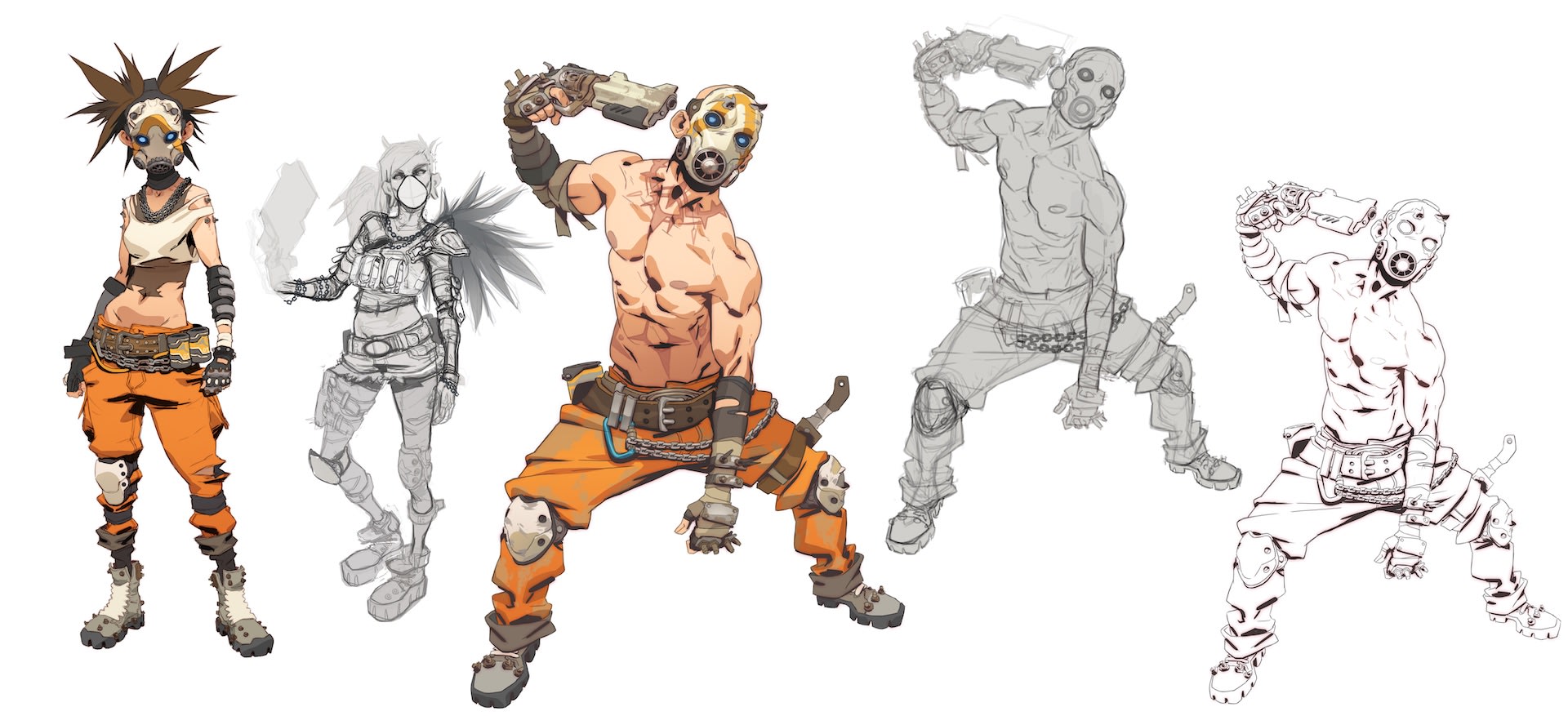
Something had to give, Gearbox understood, and starting from scratch was not an option - recouping the funds already spent on development would be impossible. Chief creative officer Brian Martel decided the only way was up. To stand a fighting chance in the Triple A shooter market, Borderlands needed to stand out from the crowd. Going through old concept drawings used in early development, he hit on a range of sketches in a graphical quasi-comic-book style, defined by black ‘inked’ outlines and exaggerated body proportions. This could turn heads, Martel thought, and the studio agreed.
Borderlands concept art
© Gearbox
From this moment on, things finally started to gel. The new art style was better suited to match the quirky gameplay. It also allowed for incorporating more fun ideas in every department. Serious and realistic stuff went out the window and got replaced by things geared towards the fantastical. No longer a gloomy space opera, Borderlands found its feet as an oddball space western where cowboy revolvers exist next to futuristic space blasters, and where goofy gameplay (healing bullets!) is the main feature, not the sideshow.

Cross-hatching
In the end, the ‘Borderlands style’ became synonymous with ‘cartoon style 3D games’. It’s not hard to see why. Black ink outlines, hallmarks of (two dimensional) cartoons and graphic novels, were never a part of 3D video games before Gearbox implemented them - why would three dimensional models of characters, animals or vehicles have an outline? Same with cross-hatching: why would 3D games, where shadows are a logical extension of the in-game lighting, need cross-hatching for those shadowy parts? The answer is simply: because Gearbox adapted a 2D art style for a 3D game, forcing (digital) drawing tools to behave like pens on paper would, and using photoshop workarounds and hand-drawn lines to embellish models and textures.
Borderlands concept art
© Gearbox
This adaptation leaves many an art lover riddled. Time and again, pundits call Borderlands’ style ‘cel-shaded’, because the colors look like they do in classic 2D cel-shaded animation and have outlines. An honest mistake, but something that downplays the brilliance of Gearbox’s approach to color saturation - they keep on correcting the mistake on social media, as it is clearly a point of pride. The explanation is a bit technical (watch this tutorial if you want to know the full details) but revolves around dialed back textures (skins, clothing and such), leaving objects with (almost) monochrome surfaces, which are used as a basis for (hand-drawn) black accents, cross-hatches and outlines.

Appeal
The rest, as they say, is art history. Borderlands’ vault hunters came back for more in Borderlands 2 (2012), The Pre-Sequel (2014), Borderlands 3 (2019) and various spin-off games, excited to enjoy the dramatic absurdities of vault-hunting over and over again. Art-wise, Gearbox doubled down on the style over the years, finding new ways of expression within the style’s limits, in games as confident about themselves as they are colorful.
Borderlands concept art
© Gearbox

Borderlands 3 Fine Art Print Collection

Look into my eyes when I stare at you!