Museum-grade quality prints Worldwide shipping Largest video game art selection in the world Lifetime guarantee on prints
God of War: Constructing Alfheim

article

God of War: Constructing Alfheim

How do you find the right tone for a God of War game?

Maarten

19 Jun 2018 ⋅ 10 min read

We're excited to celebrate our official God of War Collection of game art prints, and notebooks. Our newest addition are these stunning God of War Notebooks! Take a look at them and then read on to get a deeper look into how Santa Monica Studio created God of War’s Alfheim.

Spoiler warning! We recommend playing through the game first before reading through this story.

A radiant, beautiful light constantly beckons you closer and closer in the middle of this strange realm. At the same time, you see a lingering darkness emerge throughout your adventure here as you see the Dark Elves fighting against the Light Elves. This is complemented by the architecture you come across, which is gorgeous, arch-laden, in marble and towering high over you. Then, a twisted, glowing red hive awaits you at the center point of your journey… a stark and patched together contrast to the beauty that you've witnessed. These are some of the strange, yet fascinating dichotomies you experience venturing through Alfheim, the first realm you get to explore outside of Midgard.
Constructing Alfheim 1
© SIE Santa Monica Studio

Concept art for God of War, used to find the right tone for the game. Art by Luke Berliner.

Everything Begins and Ends at the Light

Alfheim was the first realm the team worked on after designing Midgard and it would set out how fantastical, yet grounded the other areas of the game would become. Although in popular culture, certain areas of Norse mythology have been explored, many of the actual realms had not been well-represented and would challenge the team to approach this with a sense of thematic consistency while weaving in the team’s own unique flair. Luke Berliner, lead environment concept artist, recollected the first directive of the game, stating, “There was a lot of creative liberty in defining what the realms meant to us.”

The first pillar of designing this realm became the Light of Alfheim, where Kratos and Atreus would journey to in order to power the Bifrost. Much like the Mountain in Midgard, the light would be a centerpiece that would continually direct you towards where you were heading. “Cory, our creative director, had this idea of a central light source that was the only light source in Alfheim, feeding into the narrative hook that you needed the light to progress.” The team started to toy with a number of ideas that would center around that. For instance, there was a lot of interest in showing off how life and death, one of many dichotomies that would appear, were big parts of the realm because the lake was supposed to represent the Lake of Souls
Constructing Alfheim 2
© SIE Santa Monica Studio

Concept art for God of War. Art by Luke Berliner.

Another fascinating artistic challenge that the Light of Alfheim affected was the foliage. All around Alfheim, as you venture through by both foot and boat, you experience varying tree shapes and otherworldly environment art. Much like everything in this area, even these trees are affected by the Light of Alfheim. Luke explained, “Early on, the trees, the environment looked like as if it was growing towards a singular light source and that would look very different than Midgard or any other place. I really liked the singular idea of that light source and how an entire ecology has grown around that in a unique way combined with a more fantastical architecture.” This idea led to interesting concepts where the team played with the region’s fauna and how that would react to having a light source centralized as a beam.

The team would narrow this down even further to the exact tree types they were inspired by, which were different, depending on the realms that they were working on. First would be exactly those types of trees that would show off an ancient, yet elegant environment that would contrast well with Midgard’s environments. “One of the things that we looked at were different, really old growth trees,” Luke said. “Things like a bristle cone, pine trees, and old olive trees…things that have kind of grown for a really long time and have an interesting form to them.”
Constructing Alfheim 3
© SIE Santa Monica Studio

Lighting study for God of War, by lighting artist Erik Jacobsen.


Complex nature

Sr. Environment Artist, Erik Jakobsen, then took those concepts and translated them into the 3D in-game environment, although the process wasn’t so simple due to the complex nature of trees chosen. “These amazing trees, stretching towards the light, were definitely one of the first things I remember from Luke. This being the first realm you travel too made it difficult to strike a balance between real and magical. What looks good in a single beautiful concept sometimes needs to be tested out in 3D to get the balance correct. Leaves that are too red or too white may throw off the other level elements.”

Although difficult, the end result was a very cherry blossom-like feel to the trees, but with a darker tinge that wasn’t as pronounced in the original concept artwork. Luke mentions, “It was interesting because the concepts had the notion of a lot of this, but in 3D, slowly, everything kind of evolves. So, you got the more beautiful leaves in the 3D space and so things come into their own on the environment side.”

The Collaborative Design of Elvish Architecture

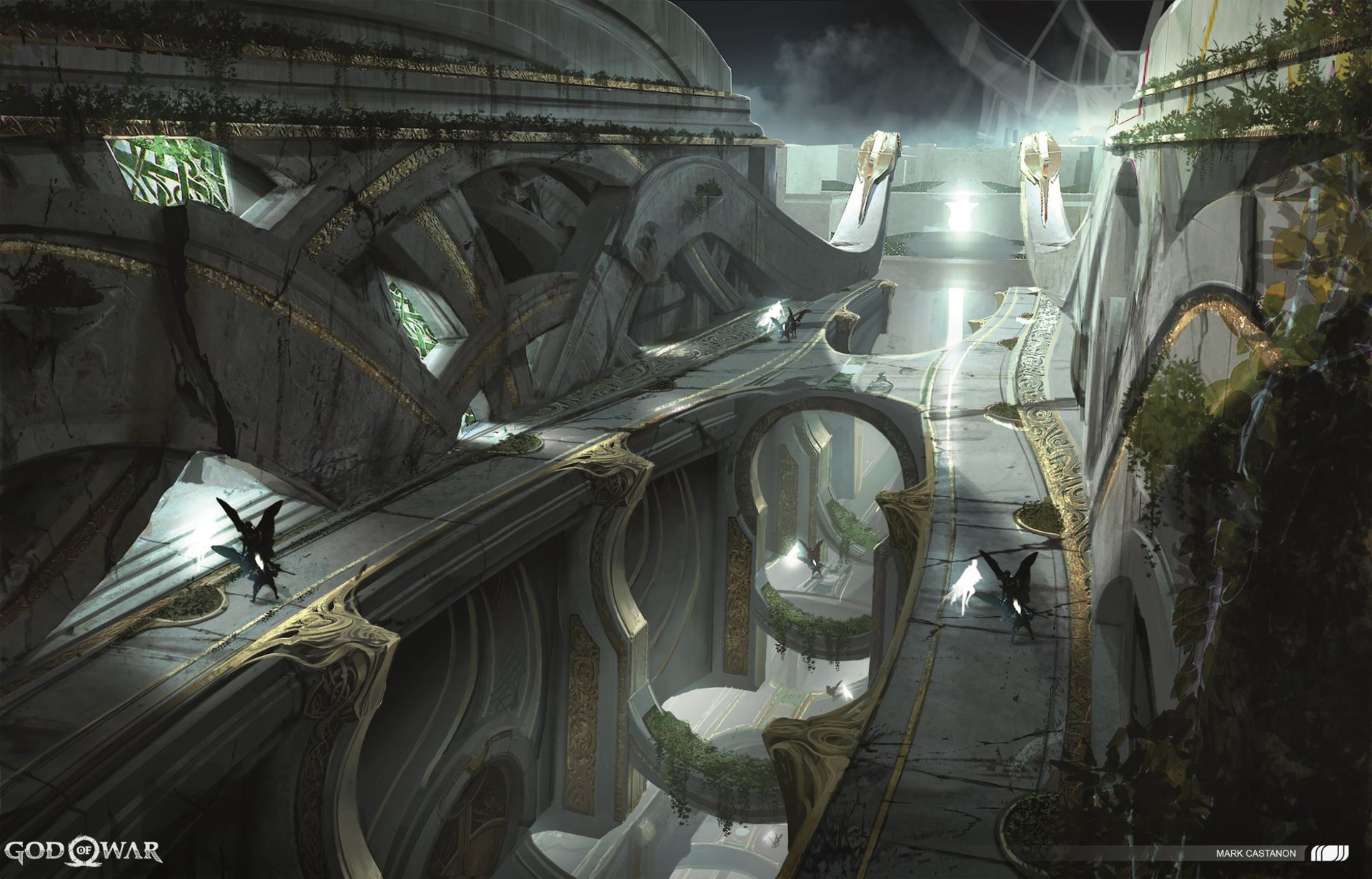
From the environment, the team moved onto the next complex challenge – the architecture and building structures worthy of the two warring elven factions. Much like the foliage, the team was grappling with how to differentiate the structures of Alfheim against the earlier Midgard environments that the player had experienced. The team would utilize both the ‘time period’ of the game being pre-Viking and its relation to the other realms to start designing the construction. Luke recollected, “We were trying to figure out – what makes Alfheim narratively even unique and different from Midgard. A lot of the architecture in Midgard was very square stone and blocky. And we thought maybe we should use more traditional Viking knotwork, saying that these types of things existed in the other realms, and slowly filtered into Midgard to create what we know as Viking design or the Viking inspiration that we know of today.”

Much like with the trees, this concept was not easy to completely translate into the 3D space and required lots of collaboration between the entire team. The first section of the challenge started with understanding Viking knotwork – known for its intricate curves and lack of straight lines. “The challenge was that everything had a curve. Viking knotwork is not modular like most architecture is,” Erik mentioned. “Luke and the concept team had a lot of really great concepts, but they do not show every angle we see in-game. A curve has to be balanced, land into the next shape and flow into the next curve. I had two great artists work with me on the level - Charleen Au and Sarah Swenson, and eventually, we developed solutions for all those curves!"
Constructing Alfheim 4
© SIE Santa Monica Studio

Interior design study for God of War, by artist Mark Castanon.

The next step for the team was to create distinct locations and make sure that everyone on the team was on board. The trench, which was the main section that you venture into to get to the Light of Alfheim, originally started out very differently, before ending up with a more futuristic/fantasy-like set of movement options. At one point, it even had three different trenches overall, rather than the singular one it ended with. Erik remembered, “I did an original mock-up of the trench going down into the lake, which looked different than it did in the final game. But I remember that Andrew Chrysafidis, our level designer, suggested having the doors open to reveal itself like an elevator.” This ended up being a major concept that was utilized throughout the entire area of Alfheim in collaboration with the concept and 3D environment art teams.

Fun gameplay

These collaborative processes would continue throughout the entire creation of Alfheim, each with its own set of challenges and successes. The main Alfheim temple, for instance, brought along the challenge of integrating a lot of cloth, while also trying to work with level design in building a fun gameplay scenario. Luke mentioned, “We decided to make it look fabric early on, which posed a lot of challenges for environment art to make it look different. Just to get the fabric to behave properly over the design space - there’s quite a bit of work that went into that.”

Erik added, “Part of it was fitting the level design back into it because it was one of the first levels that the team as a whole had to work through constantly. So, trying to fit that intent and hold the integrity and still fit it into the design space was tricky.” The end result, though, was a very unique and distinguishing temple that was much different than the other realms, thanks to the technology and collaboration behind it.
Constructing Alfheim 5
© SIE Santa Monica Studio

Concept study for God of War.

One other collaborative challenge came with the Hive, where lighting brought major changes through its creation, bringing in a challenge unlike those encountered in the other sections of Alfheim. The team had to think about how these changes would affect the overall design and feel of getting to the Light. “Originally, the light was just supposed to be white or a light blue,” Luke recollected. “But Cory had always wanted this Hive over the Light, and then he wanted the light to be able to be dimmed and then go on brighter. Because of this, Erik and I chatted about making the Hive glow similar to a lampshade, tinting it red which would permeate to the entire exterior of the temple. Because of this, when you remove the Hive and go back outside, there’s a huge state change and you feel like you accomplished something in a grander way than if it was just brighter.”

Erik remembered the difficulty of two lighting states: “The lighting system is powerful but also a dense interconnected web of layers. If one area of Alfheim gets nudged, the entire web shifts and needs to be readjusted. Multiply this complexity by the two states – the captured and the freed lighting.”
Constructing Alfheim 6
© SIE Santa Monica Studio

Concept study for God of War, by artist Luke Berliner.

Conclusion

Alfheim is a realm brimming with two sides constantly at war with one another that translated not only literally into the game, but also into its design. Although you may come into Alfheim with the expectation of a straightforward, beautiful realm, you come away with perhaps more conflicted feelings on the warring factions and the two sides that continually appear throughout the heroes’ journey here. “It’s intentionally confusing between the Light and Dark Elves – who’s good and who’s bad and what you should and shouldn’t be doing,” says Erik. Your expectations of the situation continually get toyed with as you, perhaps, unintentionally change the landscape of Alfheim.

“You change the course of the realm, so you see that continually reflected through the environment. You’re not just visiting, but altering the course of Alfheim, even if it is to just get what Kratos and Atreus need or want,” Luke concludes.

This article was originally posted on godofwar.com.
Make sure to visit Santa Monica Studio’s ArtStation Art Blast for more art from the God of War team.

The official God of War Art Collection

Boy!